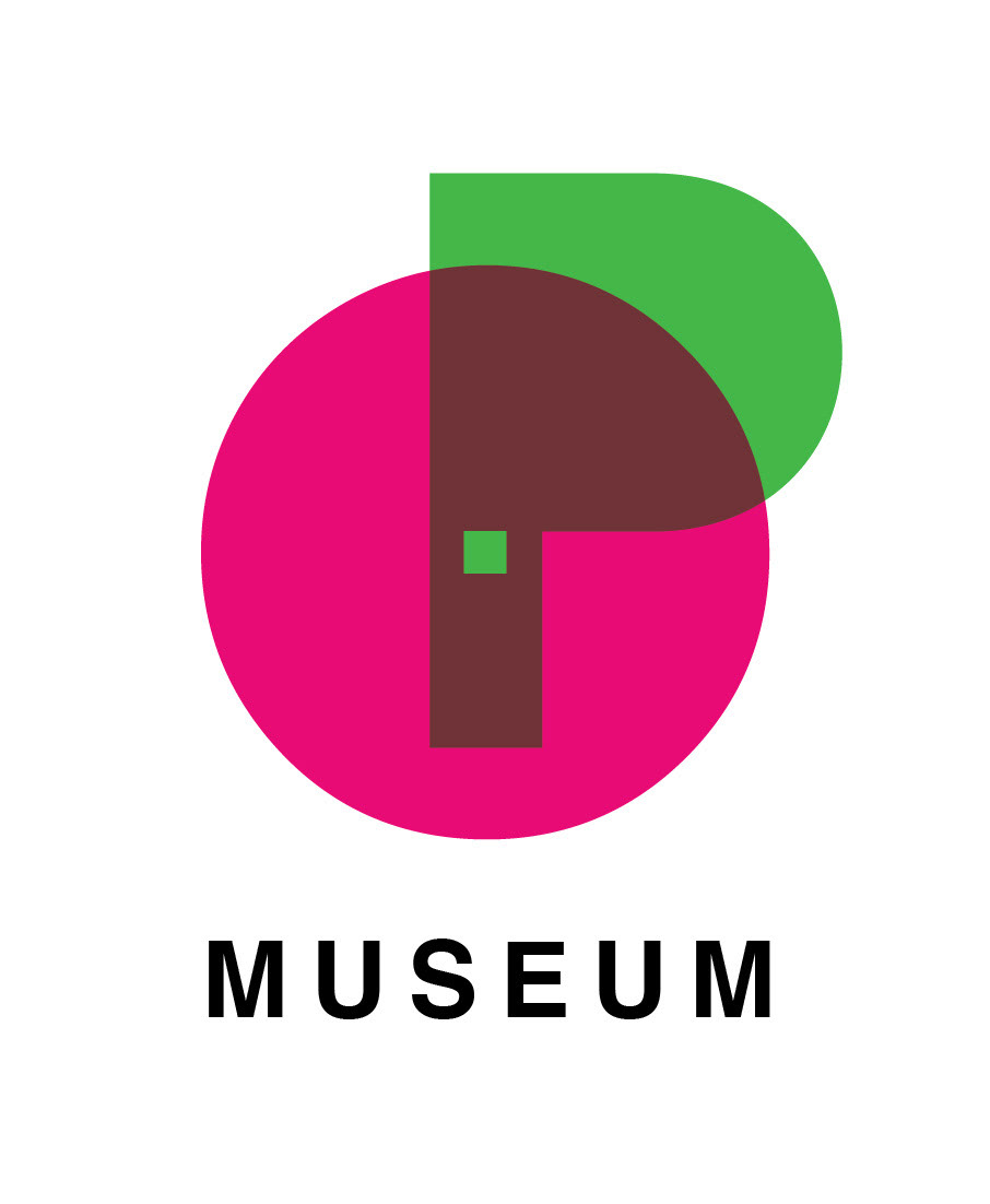
The OP Museum
Museum of Optical Illusions
Mission: To entertain and promote optical phenomena in art, drawings, photography and new media. The Op Museum offers its visitors the opportunity to experience the world of optical illusions and different kinds of perception.
What we think we see isn’t always what is truly there. Our consciousness and our thinking keeps us captured in what we know and have experienced. It never ceases to amaze how one can get caught in contradiction or paradox.
Target audience: children from 5 years old, teenagers, man and women of all ages, tourists, designers and artists.
Tagline: Nothing is what it seems.
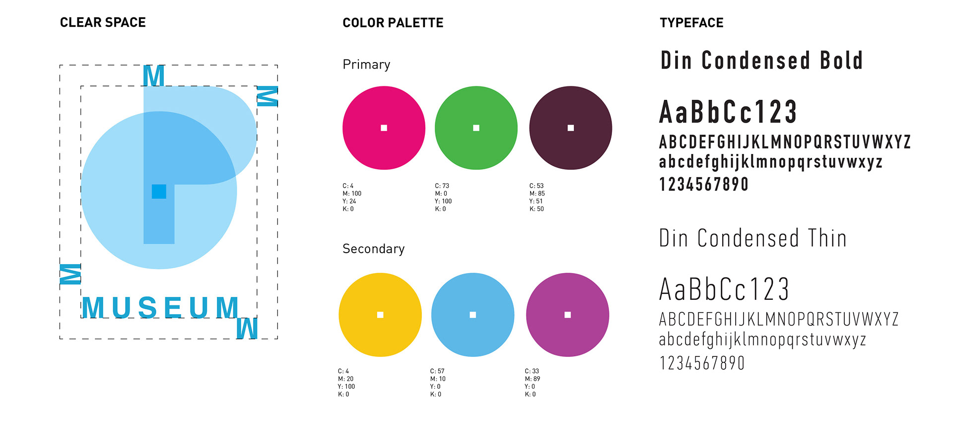
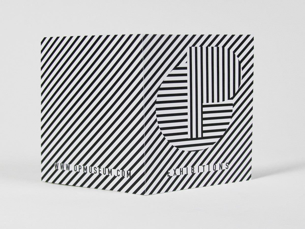
Museum Logo creates the illusion of overlapping, when you have to decide which object is above. Logo uses the opposite colors that create high tension and play tricks with your eyes when placed together.
Museum of Optical Illusions
Mission: To entertain and promote optical phenomena in art, drawings, photography and new media. The Op Museum offers its visitors the opportunity to experience the world of optical illusions and different kinds of perception.
What we think we see isn’t always what is truly there. Our consciousness and our thinking keeps us captured in what we know and have experienced. It never ceases to amaze how one can get caught in contradiction or paradox.
Target audience: children from 5 years old, teenagers, man and women of all ages, tourists, designers and artists.
Tagline: Nothing is what it seems.
Museum Logo creates the illusion of overlapping, when you have to decide which object is above. Logo uses the opposite colors that create high tension and play tricks with your eyes when placed together.
Branding consists of bold colors for they work better in capturing people's attention and showing different illusions.
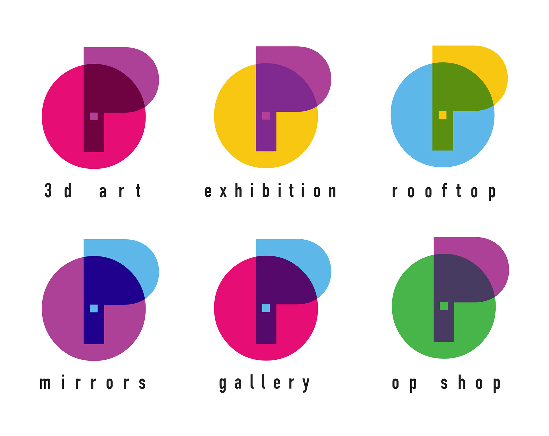
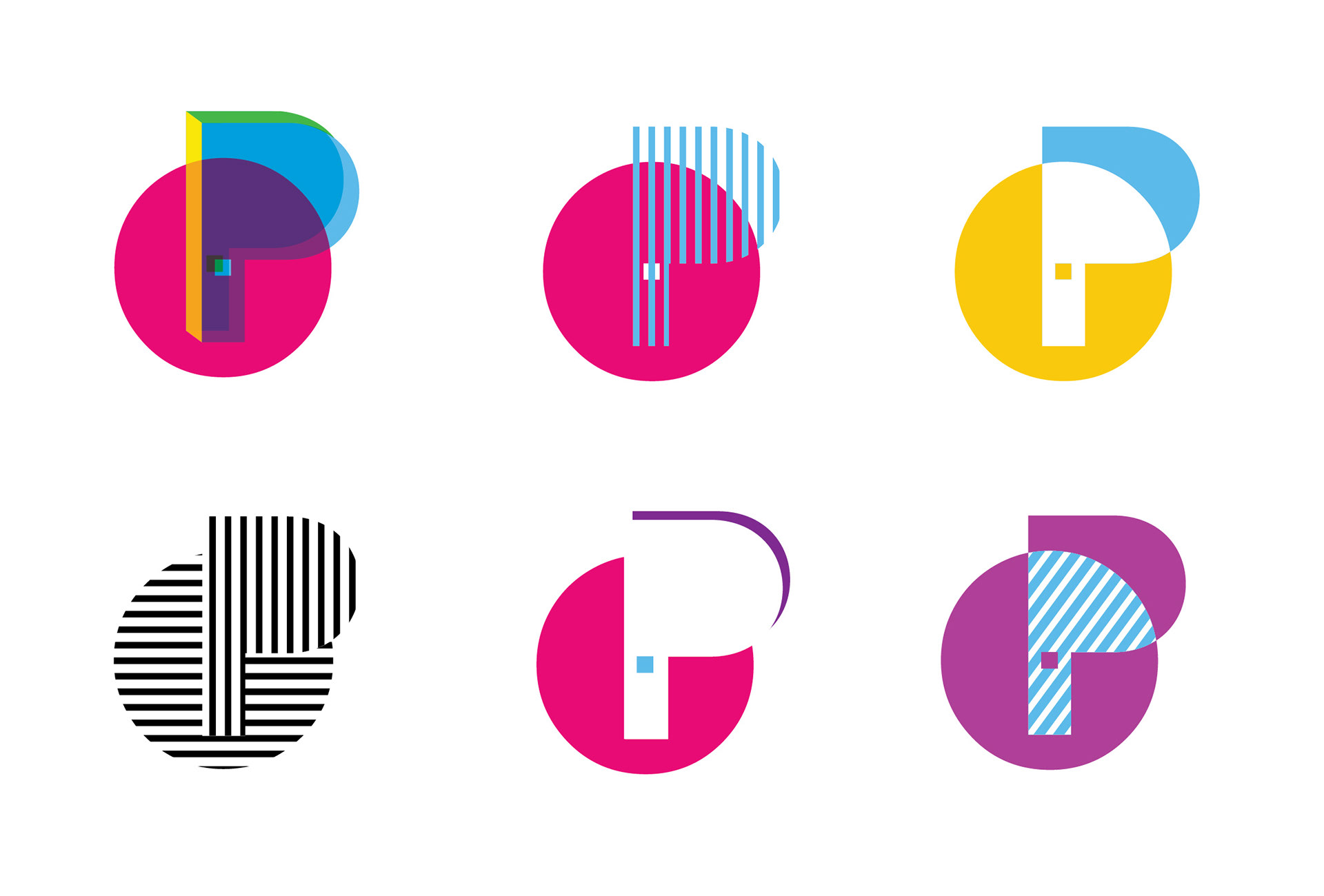
Secondary Logos.
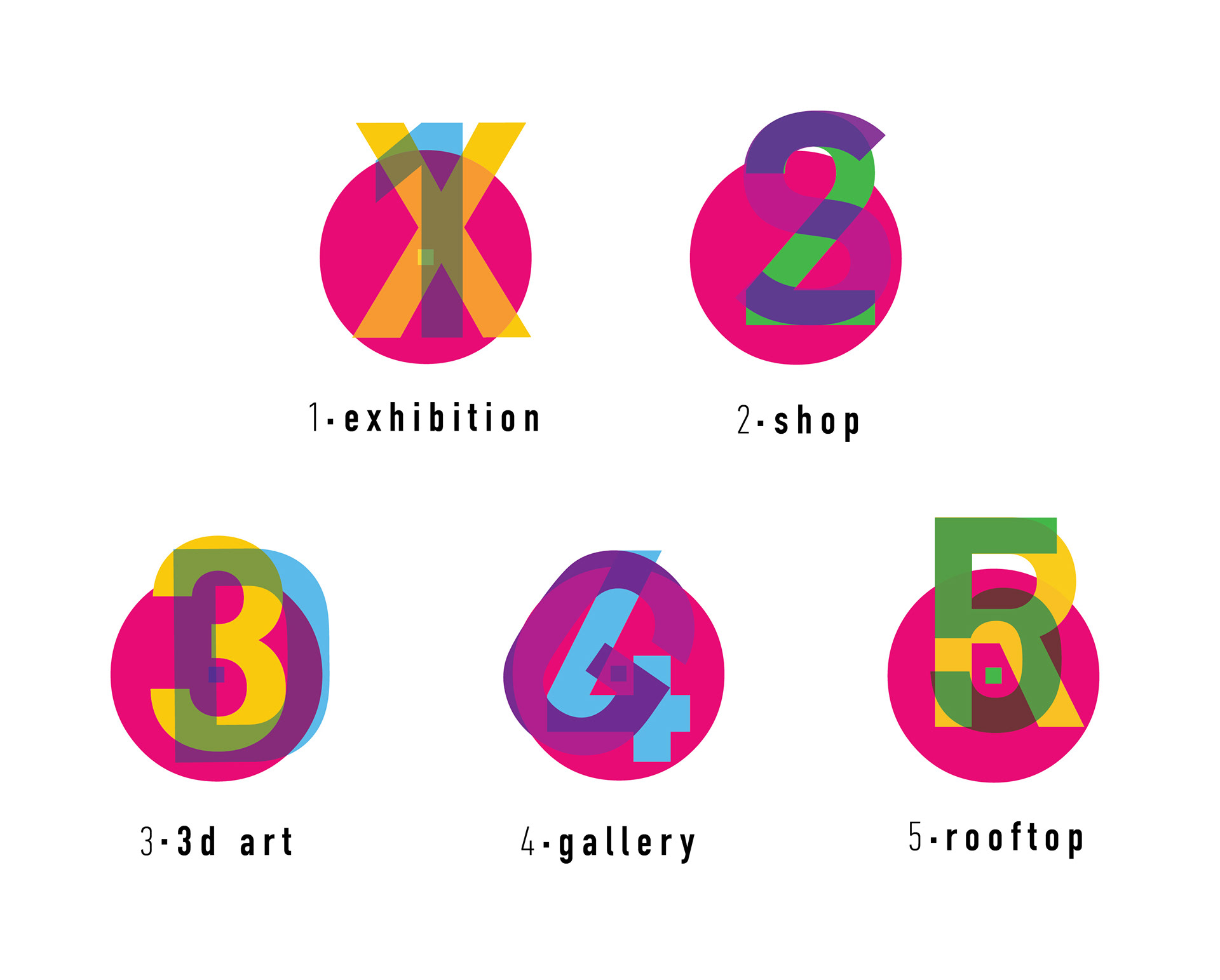
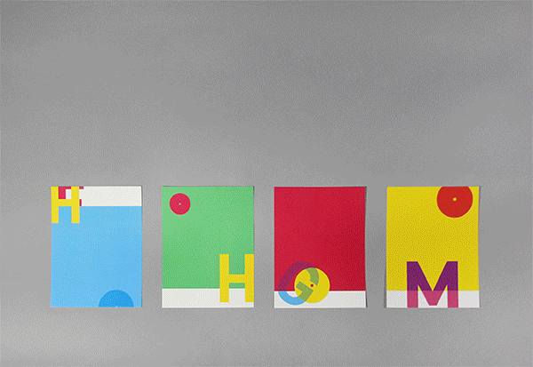
Floor Signage System overlaps numbers and section first letters creating multiple levels illusion where you can focus on one character or another.
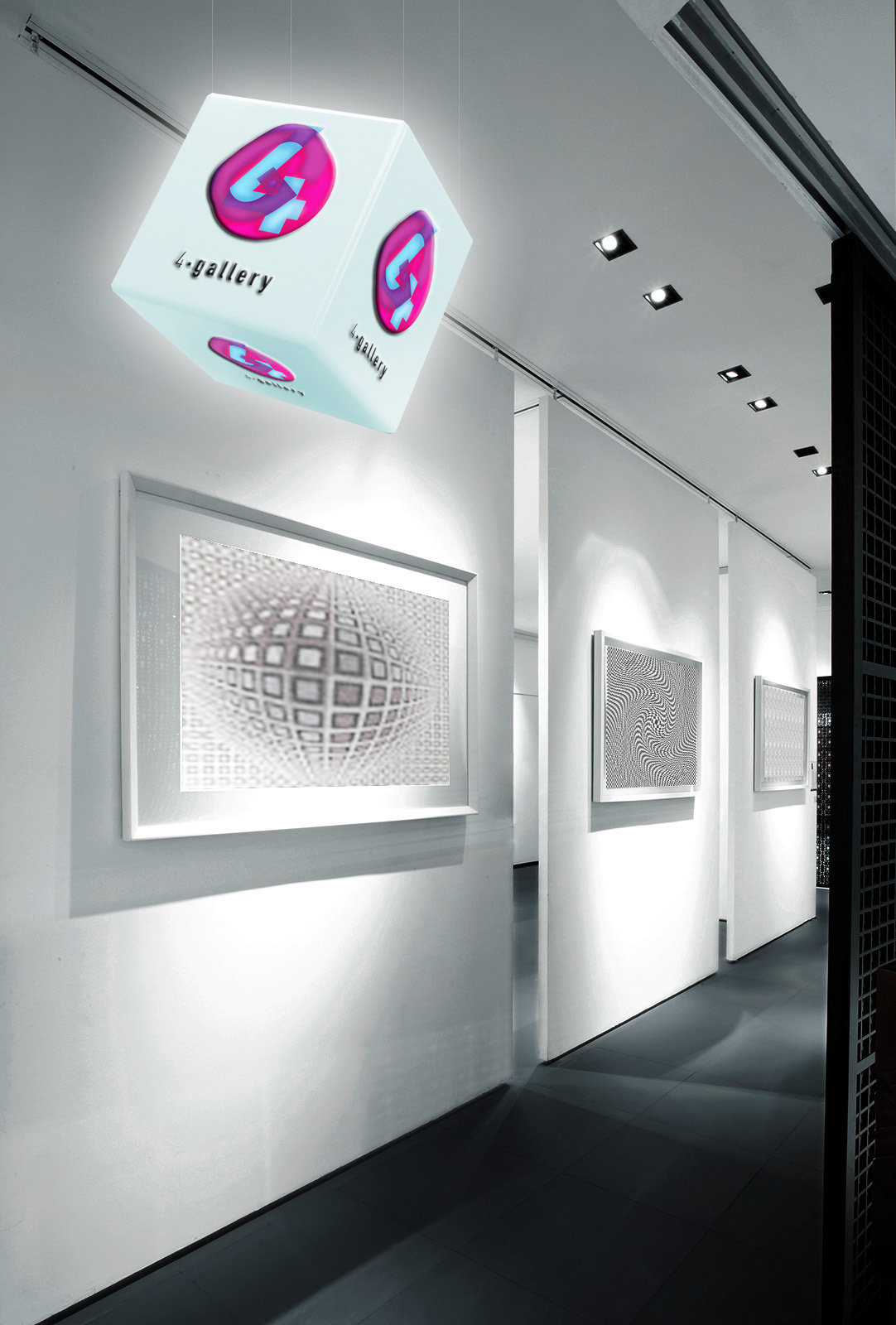
Floor Signage is placed in lightning cubes that are hanging from the celling and are looking as they are floating in the air.
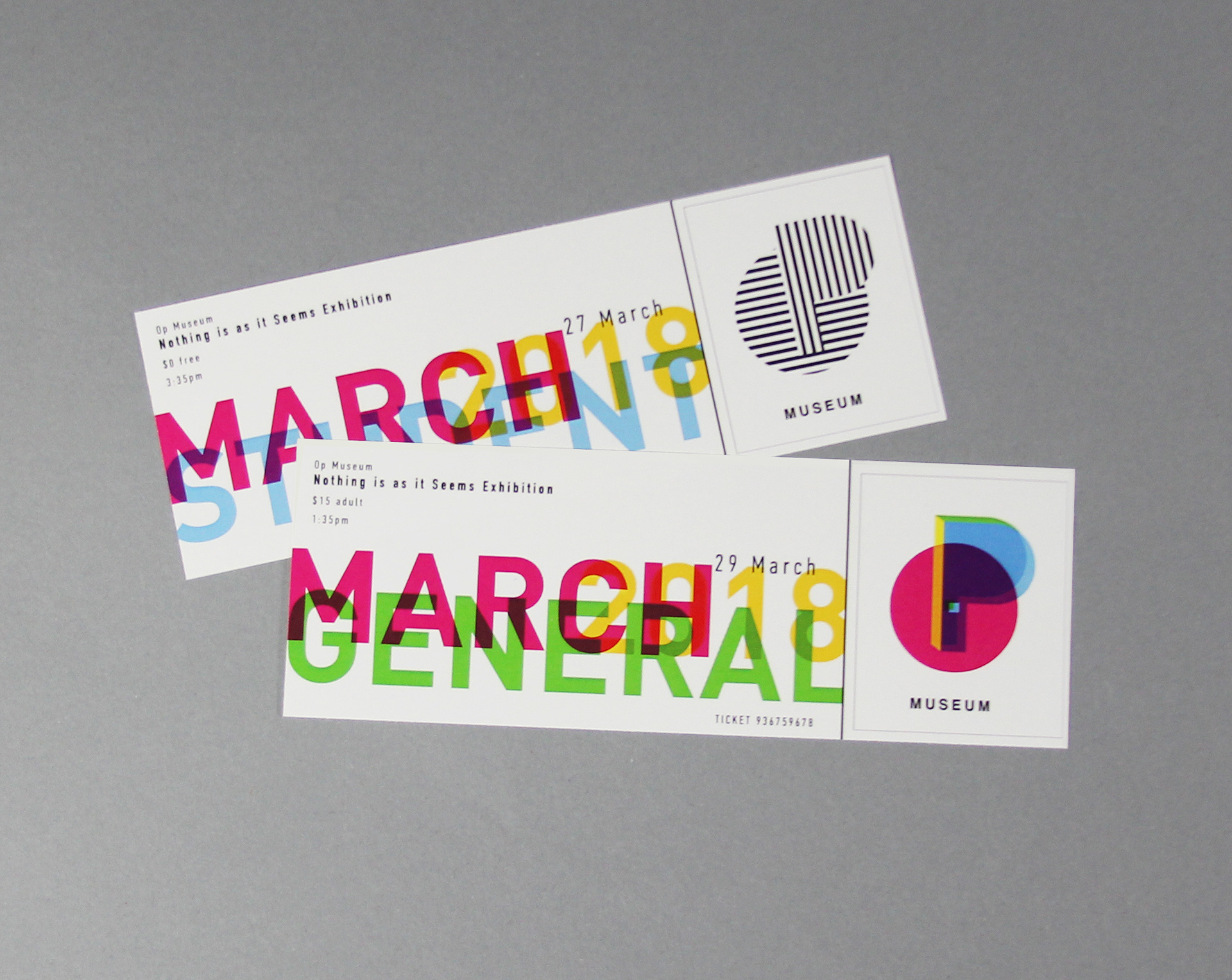
Tickets with different stickers for each day.
Stickers examples.
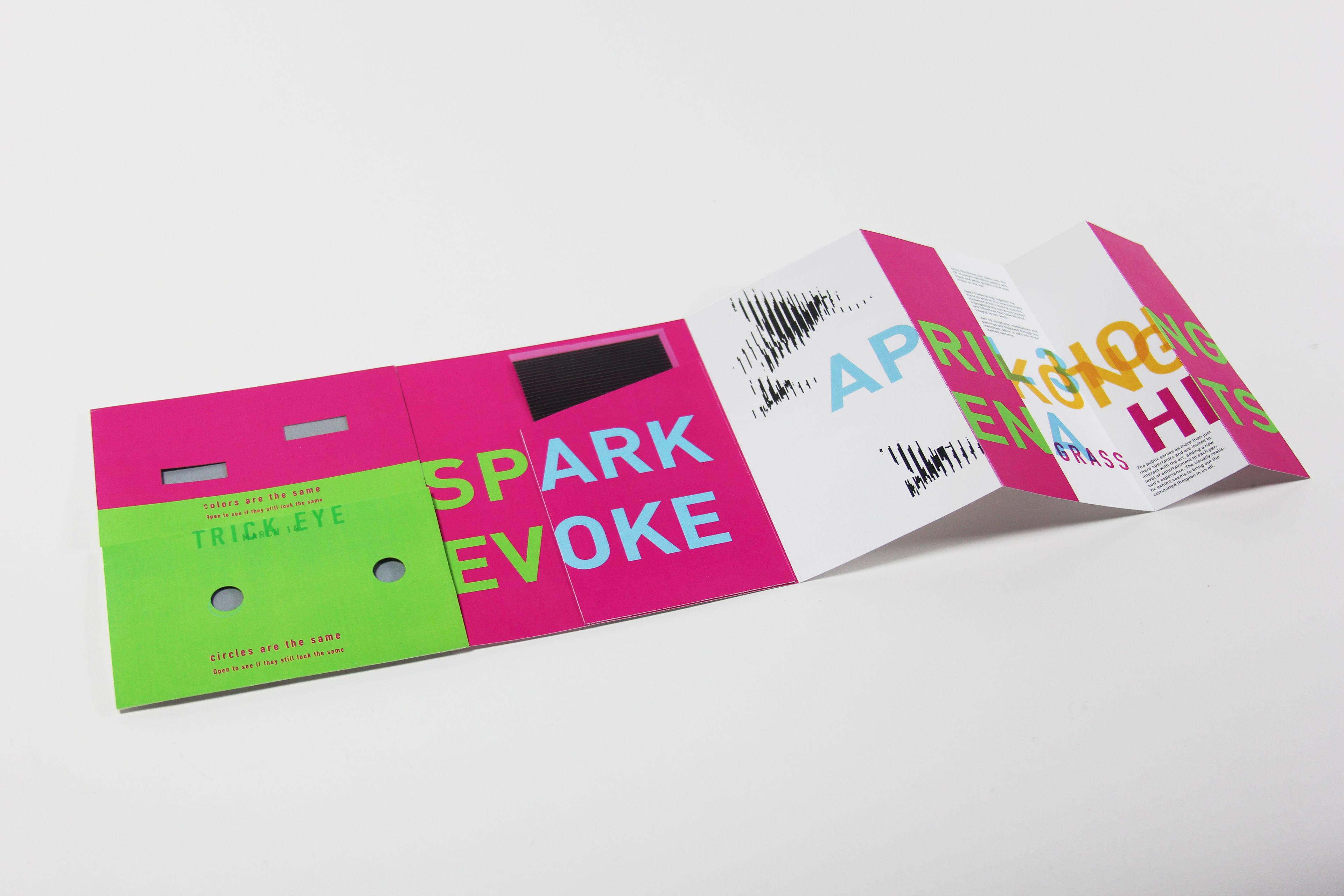
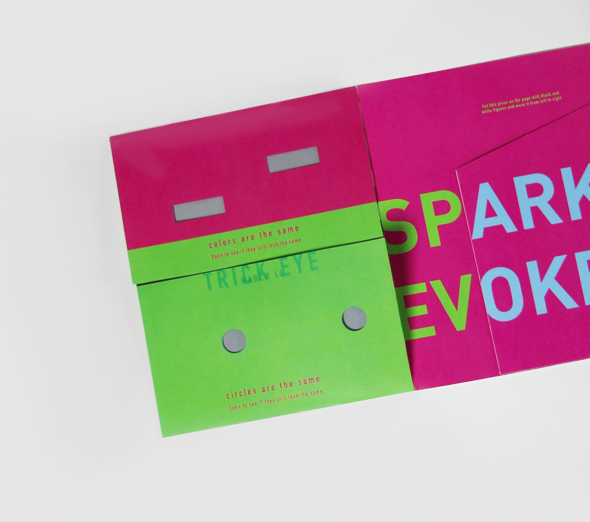
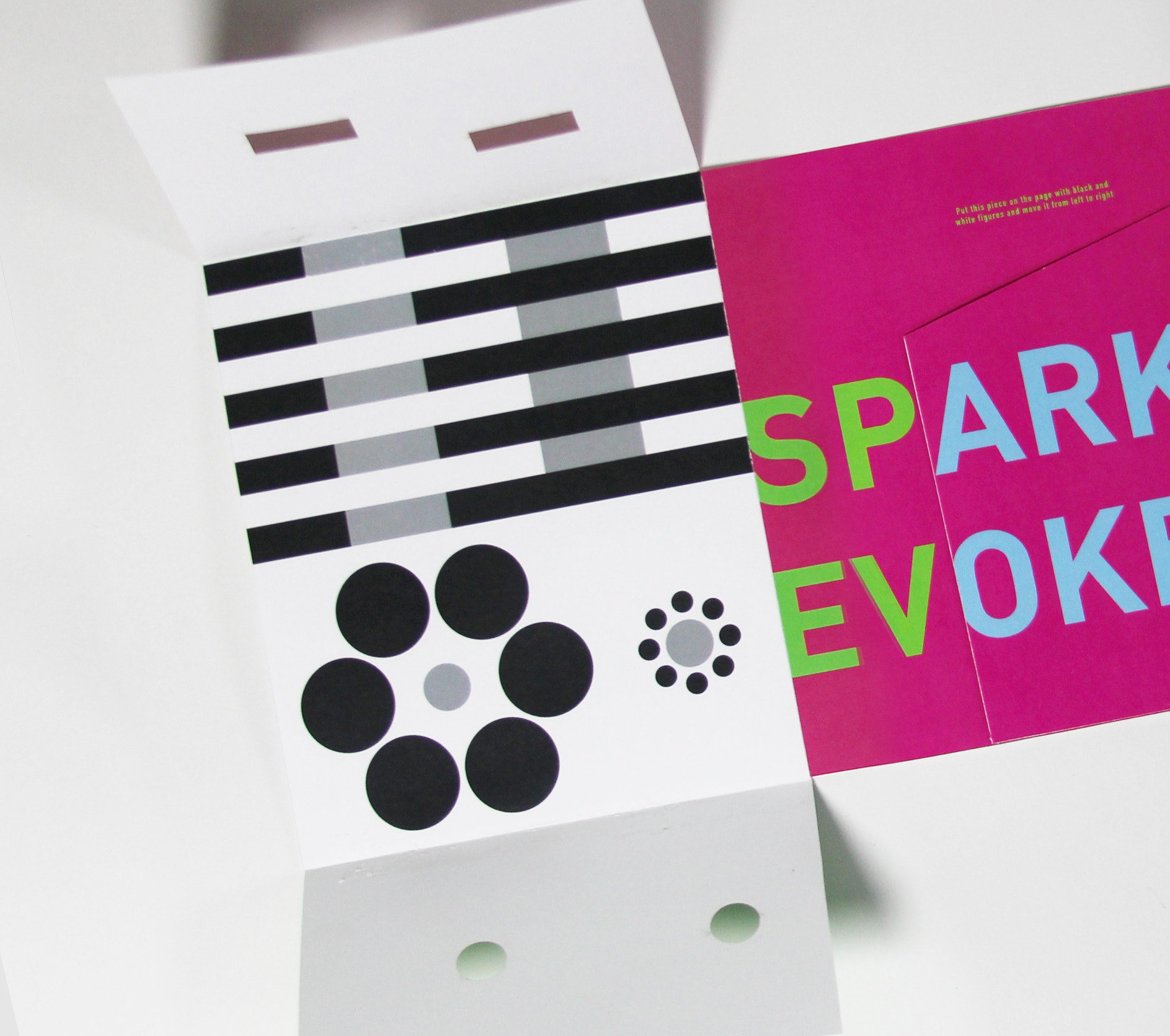
Brochure introduces exhibitions every 3 months. It shows sample optical illusions to engage visitors and make them take this brochure with them.
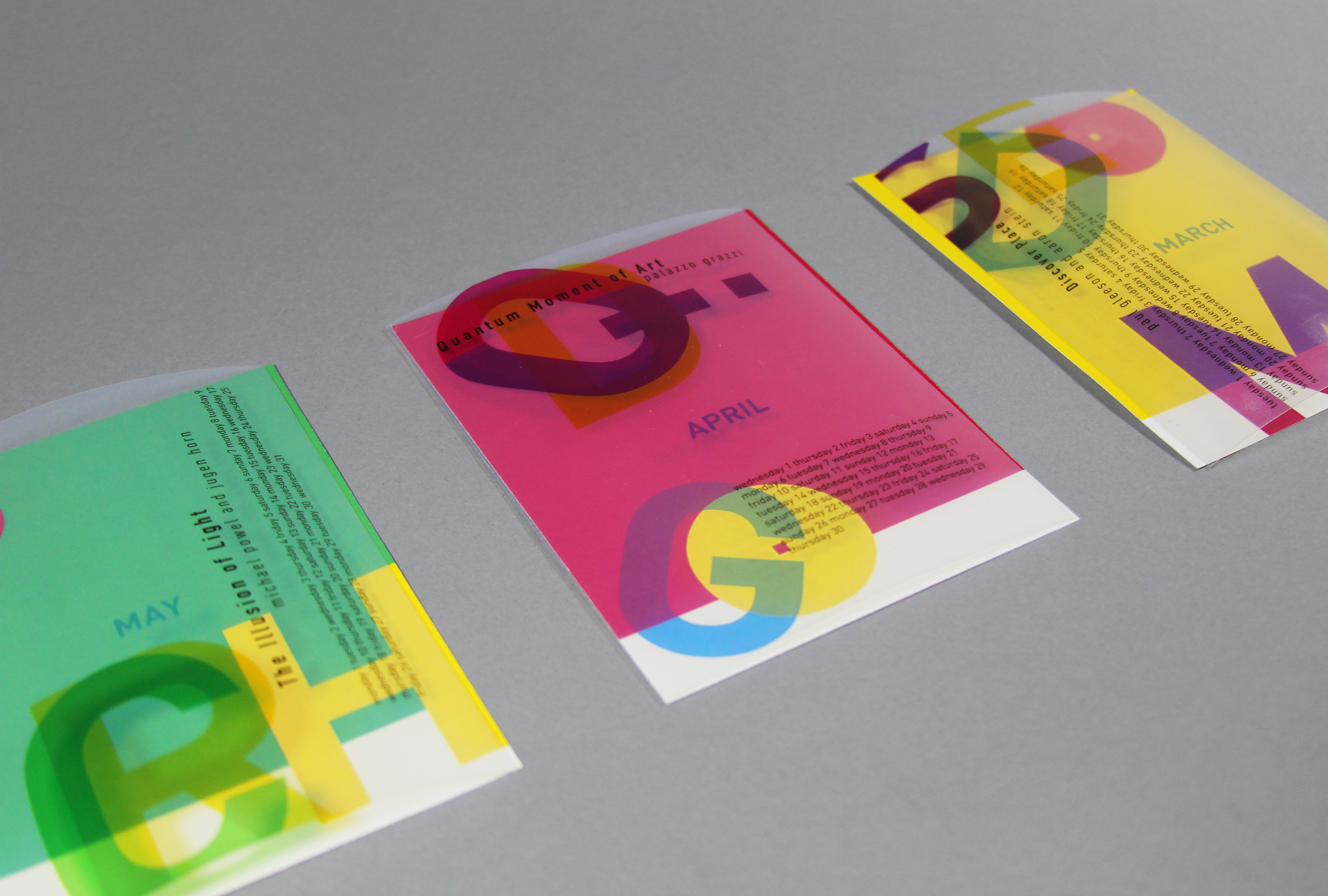
Interactive self-build calendar consists of 12 background pieces and 12 transparent sheets with information on each month that you can mix and match they you want, creating different graphics. Each month provides information on featuring exhibition.
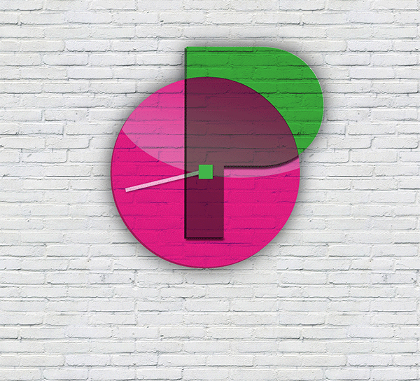
Gift Shop Item – Op Clock.
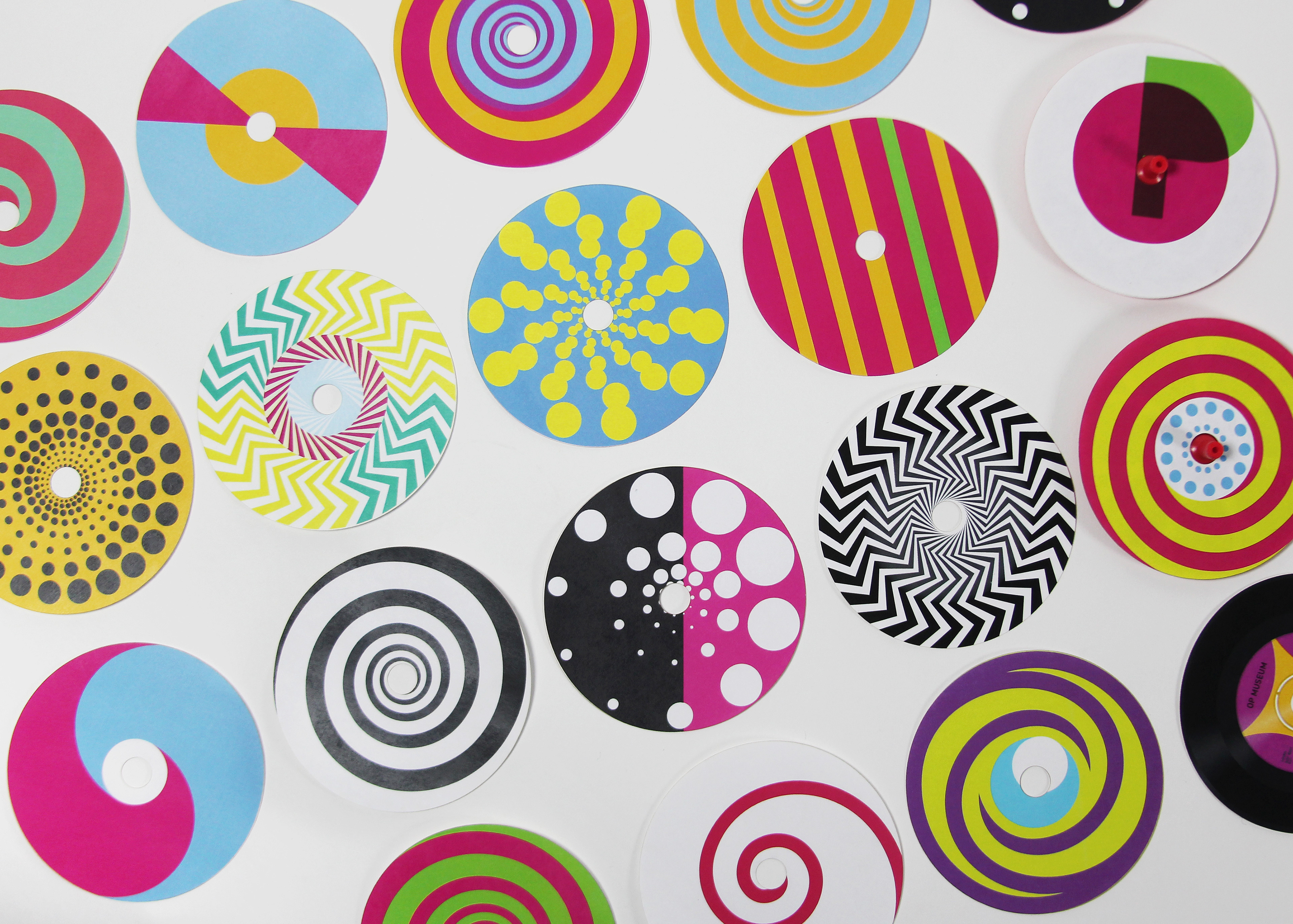
Gift Shop Item – Spinning Tops Collection.
Spinning Tops Workshop Poster. Placed in Op Shop.